Making new friends
And keeping the old (Charter). Hello, Marat Sans and Noe.
We’d like to introduce you to a couple of new friends of ours here at Medium. You may have seen them lounging about.
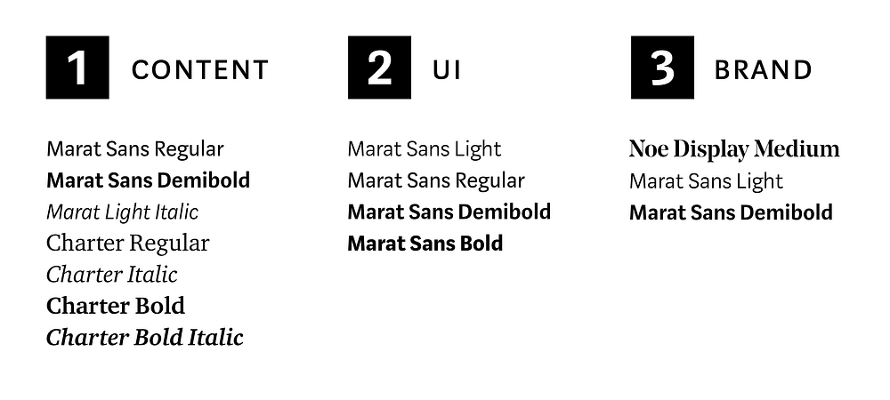
Noe is our new Medium brand typeface. Noe made its first appearance in August, when we launched our new brand identity. Noe Display Bold is the face we used as the basis for the Medium wordmark. We’re using Noe Display Medium as the voice of Medium on marketing pages and in places where we encourage users to sign in and upgrade. When set in Noe, these messages are eye-catching and clearly set apart from the content of stories so that readers aren’t confused where an author’s writing ends and the platform begins.


Marat Sans is our new sans serif typeface. Starting today, we’re rolling it out for headlines, captions, drop caps, and pull quotes on stories, paired with our old friend Charter. It appears as the heading and subheading on story previews. Marat Sans is a sturdy, readable, and compact sans serif typeface with just enough personality not to be boring. We’ve been living with Marat Sans internally for the past few months, and we’ve been very happy with how hard-working and versatile it is. It also has some gosh-darn beautiful numbers.

You’ll notice, however, that Marat is doing more work for us than just in stories — we are using it across our UI on Medium too. It appears in settings, profiles, notifications, and metadata, among other places. Instead of using system fonts that can differ significantly across platforms, browsers, and operating systems, we’ve decided to employ Marat Sans throughout. We want you to be subtly aware of Medium, the platform, as you use our site and apps, and we want, say, a Mac user with an Android phone to have a more seamless experience, wherever they’re reading Medium.

We’ll continue to improve our typography, fine-tuning how Marat Sans and Noe appear on Medium. We welcome your feedback. For now, we hope you say hi to our new friends and make them feel at home.

