Rebooting the Medium Identity
We launched a new Medium brand identity across our site, apps, and social media accounts this week. The new Medium wordmark draws inspiration from magazine and newspaper editorial mastheads — a nameplate in a bold, serif typeface that makes a strong statement for the Medium brand. We wanted to create a mark that would reference the tradition of print publishing but also feel timeless and fresh in the digital context.
Our previous logo launched in 2015. We liked the bright green and three-dimensional forms, but over time, it began to feel too digital and complex — it was difficult to adapt into many contexts, and was a little cryptic for first-time viewers. With a refocus on our core mission of connecting readers and writers at the start of the year, we thought it was the right time to revisit how we, Medium, express ourselves visually.

Manual Creative led our exploration of various logos, monograms, and typefaces for wordmarks. We considered how different options rendered on web, iOS, and Android at various scales.
The result was a wordmark that feels confident, premium, timeless, and modern. It’s well-suited to committed users who read and write on Medium regularly, as well as new users visiting our site and apps for the very first time.
The new wordmark is based on Noe Display Bold. To us, it feels like the right balance between modern and traditional, with strong, angular serifs, and contrast between the thick and thin strokes. Typographica has a little writeup on Noe Display if you want to nerd out more.
We modified some details of the original typeface in creating the wordmark. Can you see what we changed?
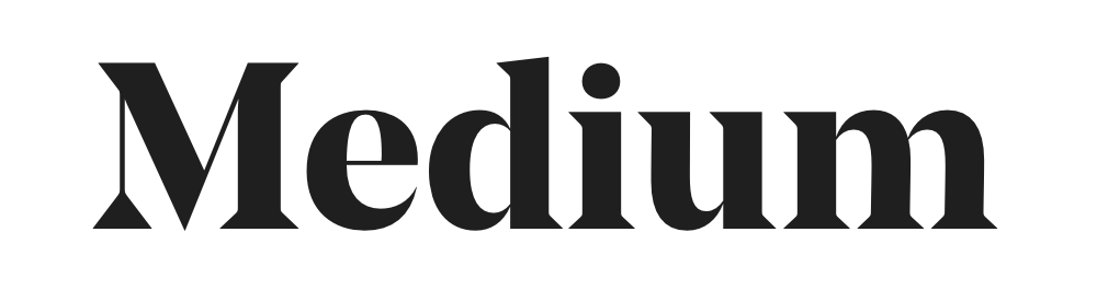

- We increased the thickness of the stem of the “M” so that it wouldn’t be lost at small scales.
- We modified the bottom serifs to create continuity, movement, and improve legibility.
App icon
If you’re an app user you may have noticed an update to your home screen too. We considered a simple M monogram as the app icon, but wanted to convey more about the product. With the new app icon, the M from our wordmark becomes the drop cap in a story.

Colors
Along with the new wordmark, we’re introducing some new flavors to our color palette. These muted pastels are a nod to newsprint (and highlighting). You can get a preview of how we’re applying them in our new Membership landing page.

What’s next?
We are going to continue experimenting with where we apply the branding. Providing a clean, clear reading and writing experience is of the utmost importance to us, so the brand system is designed to dial up or down depending on where it appears. You’ll be seeing more of these updates in the coming weeks.
Many thanks to the team behind the new wordmark and identity! Thanks to our head of brand Leah, Chad as head of design, and Maria as lead brand designer; Brad, Ben, Jess, Honguan, Peter, and Simon for stress testing and late-hour pixel-hinting; Alex, Eugenia, Steph, Matt, Reyner, and Koop for brand engineering evangelism; and Katie for product management.

