Medium Logo Usage Guidelines
- This article has been updated as of 10/22/20
Download zip file of logo assets here
The Medium logo, wordmark, and symbol are important expressions of our brand identity. They have each been carefully designed and constructed to achieve visual harmony, should never be altered, modified, or redrawn. Because these elements are such recognizable and highly visible brand assets, it is vital that that they are always applied consistently.
These few simple rules will help you use our logo, wordmark, and symbol to communicate the Medium brand most effectively.
The Medium Logo
This is the Medium logo. It is our primary graphic device and should be the first choice when choosing a graphic element to represent the Medium brand.

Logo anatomy
The Medium logo consists of a symbol and a wordmark. The symbol and the wordmark can be used independently or locked up together.

Logo clearspace and margins
When using the logo in a design or placing it next to other visual elements, you should ensure that it has plenty of room to breathe. This is where clearspace and margins come in to play.
The logo’s clearspace defines the distance between the logo and any graphic element it may be sitting next to in a composition. Use the cap height from the wordmark as a reference for the appropriate clearspace. Cap height = X
For example: if you were to place the Medium logo, sized 30px tall, in a logo pool next to other logos, you should ensure that the Medium logo has at least 30px of clearspace on all sides.

The logo’s margins are the space between the logo and the edge of the composition. When placing the logo in a composition use half the cap height (X/2) as the distance to the margin.
This is a suggested margin, do not place the logo any tighter — but in certain instances the space can be increased.
For example: if you were to place the logo, sized 30px tall, in the top left corner of a composition, the distance between the top and left sides of the logo and the top and left edges of the composition should be no less than 15px.

Incorrect usage of the logo:
- Do not reverse the logo.
- Do not apply colors.
- Do not rotate any single part of the logo.
- Do not stretch or alter the proportions of the logo.
- Do not change the arrangement of the logo.
- Do not apply gradients, shadows, or other effects.

Wordmark
This is the Medium wordmark. It has been engineered to work at scale across all media and channels and can be used in place of the full logo in any situation where the full logo cannot be used.
Wordmark clearspace and margins
The same general rules for clearspace and margins that apply to the logo also apply to the wordmark.
For clearspace, use the cap height from the wordmark as a reference.
For margins, use half the cap height (X/2) as the distance to the edge of a composition.


Incorrect usage of the wordmark:
- Do not type out the wordmark.
- Do not outline.
- Do not apply colors to any single part of the wordmark.
- Do not use other typefaces.
- Do not apply gradients, shadows, or other effects.
- Do not rotate the wordmark.

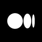
Symbol
This is the Medium symbol. The symbol can be used on its own in certain, very specific situations when the context and association with Medium is clearly established and controlled (example: the Medium app), or when the Medium brand is meant to take on a secondary, supporting role (example: an individual’s profile or a publication surface on Medium).

Symbol clearspace and margins
The same general rules for clearspace and margins that apply to the logo and wordmark also apply to the symbol.
For clearspace, use the height of the middle ellipse (this matches the x-height of the wordmark) as a reference.
For margins, use half the height of the middle ellipse (X/2) as the distance to the edge of a composition.


Incorrect usage of the symbol:
- Do not outline the symbol.
- Do not alter the spacing of the shapes.
- Do not skew, squeeze, or alter shapes.
- Do not reflect the logo.
- Do not apply gradients, shadows, or other effects.
- Do not rotate the symbol.

Logo + Color
Our logo should always be all black, all white, or white symbol with black wordmark and vice versa. It never takes on any additional colors, but may be placed on top of any color within the Medium brand palette with the exception of placing a white logo on top of yellow or any of the light colors within the palette.
Black and white:
The logo may be used as all black on white or all white on black.


Black logo on color:
Black can be used on top of any of the colors from our palette.

White logo on color:
White should only be used on top of the more vibrant colors.

Alternating black and white on color:
It is possible to alternate the color of the symbol and the wordmark, with five colors supporting both black and white on top of them.
This may be suitable to do when the symbol color matches the illustration color, and the wordmark color matches the headline or typography.
This is not the primary expression of the logo — it is an option when a composition may need more dynamism. It should be used sparingly and with care.

Incorrect color usage:
Do not use the logo in color under any circumstances.