Invisible changes
A designer’s account of migrating Medium’s story page to a modern stack

Medium started about 8 years ago. What this means is that we’ve accrued years of complexity as features have layered on through development cycles. This complexity increases the cost of innovating our story page, the heart of Medium.
Enter PPPP ⚡️
It stands for Patronus Post Page Project, aka the code name for migrating our story page from a legacy stack to a new web stack in order to take advantage of modern open source frameworks (React). The ultimate goal of PPPP was to position and power our platform for swift iteration, developer productivity, and a space to innovate.
Designing for a migration
I’m a product designer here at Medium and my responsibility was to oversee the migration from a design perspective. Now, I’d never been through a migration before, so I was discovering and defining my role in all of this along the way. I’m not rewriting code, so what’s my role here?
I broke it down into the following objectives:
- Ensure that the new story page looks and feels identical to the original
- Identify where we can make improvements
- Unify where possible; be intentional about differences
- Advance and integrate design system components
Seems straightforward? Let’s dive in.
How I spent my time 🕒
Typically, as a designer I (ideally) spend any given day immersed in the following tasks: exploring new feature concepts, creating high-fidelity designs, wire-framing, mapping user journeys, prototyping, interviewing users for research / synthesizing, etc. All of the things. For PPPP, I spent my time a little differently.
Here’s a breakdown:

It took some acclimating, but I got into a good flow. Verifying tickets and testing were critical for our velocity and quality assurance. Personally, my favorite part was design system-related tasks. Specs took up most of my time, which I’ve learned is an art-form.
I’m going to share some key takeaways from the 4 month process and then walk you through a few major (largely invisible) changes that emerged on the other side of PPPP.
Key takeaways:
1. Migrating a page on the internet is not simply replicating the original–and that’s a good thing.
After PPPP, I could maybe write a dissertation on specs. For the record, there are existing tools for specs, such as Zeplin, but there are certain limitations.
Pause. Why not just use the current post-page as a spec? It’s already built — make it look like that.
I wish it was that easy. Actually, I’m glad it’s not. Something kind of nice happens when you create ~20 anatomical blueprints for a page on the internet: you become intimately familiar with it. It forces you to observe the thing from all angles — hold it up to the light with a magnifying glass to examine its purpose, turn it inside out with tweezers, and then inspect it with the minds of your colleagues. Rinse and repeat.
Yes, specs were time-consuming for design, but the time we put into them was time engineering didn’t have to spend trying to figure out how to achieve the original UX (while meeting our design standards). Once the intimate familiarity set in, we were well positioned to verify tickets and cruise through the rewrite. They also offered an introduction to new design system components. Ultimately, I’m grateful for this process because specs served as a forcing function for intentional implementation and systems-thinking.
Before beginning the creation of specs, I did a little research with our team to determine how we could deliver specs that met the needs of our engineers, while considering scalability and time constraints.
We learned how to:
- Best visually present feature properties and values
- Match exactly what is available in storybook (where our design system lives)
- Clarify interaction guidelines
- Represent spacing between components and typography
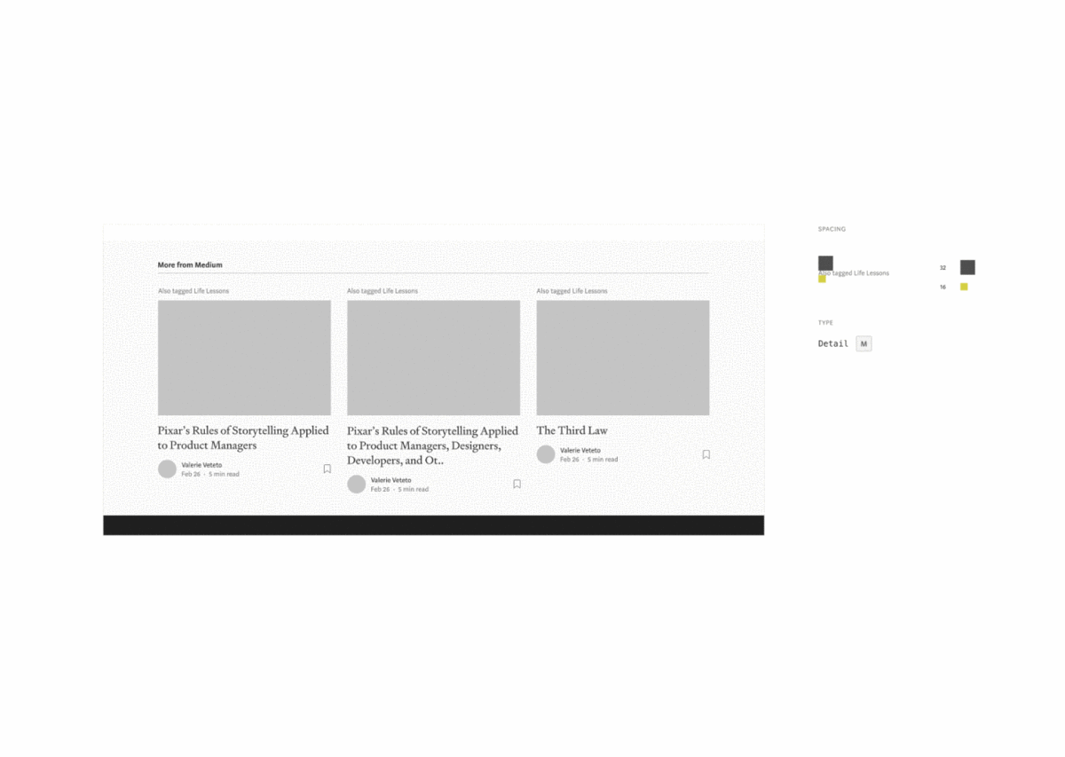
Once we landed on a system, we produced ~20 specs for every single part of the post-page.
Highlights was a fun one:

If you look closely at the specs, you’ll notice that our annotations match the new design system components as defined in storybook. This may seem trivial, but it makes a big difference for design → eng handoff.

From a design perspective, I viewed PPPP as not only an update to our code language, but as a clear channel for introducing new design system components. I worked closely with our platform engineers to represent these styles in Storybook — our source of truth for Medium’s design system.
2. Not having resources dedicated to a design system through a migration is tricky, but doable.
We don’t have a design system team here at Medium (yet!). What we do have is a small group of individuals who are passionate and curious about our design system. We meet every 2 weeks to discuss updates, process, and vision. This group operates outside of the agile system, so the work we do is not tracked the same way as product work and is often not prioritized in the same way unless there are urgent product dependencies.
And it makes sense that we don’t have a team just yet — we’re still a growing product organization. Until we have an established team, we encourage product teams to feel empowered by contributing to our design system when and where possible.
Our new design system was still in its infancy when we started PPPP. And it still is — which is to be expected. If we had waited to start PPPP until our design system was complete and all components were built, it would’ve taken months, at which point our product needs could have shifted.
This meant that we were literally designing parts of the design system while we were rewriting the story page. We discovered type styles and components needed in the midst of PPPP that I had not accounted for initially.
For clarity, I’m going to define what I mean by ‘design system’. We think of it in these 3 parts:
- Foundational (atoms): typography, color, grid, etc.
- Core (molecules): author bylines, buttons, popovers, input fields, etc.
- Feature-specific: Sign-up / Sign-in modal, meter, etc.
We entered PPPP with certain core and foundational components newly available, but for the most part, we entered the project with a design system still in its infancy due to the fact that we haven’t had resources dedicated to it.
3. Finishing with your most complex feature is rough, but humbling.
Highlights are complicated (beautiful) creatures. I’m so proud of our team for implementing them (again). It was challenging just trying to understand the feature’s nuances well enough to even produce specs in order to achieve parity.
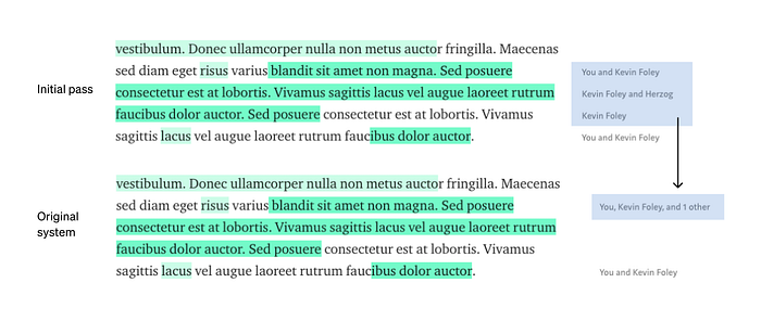
There were aspects of the feature that had slipped past me. For example, there is logic in place from the original system that, when a few conditions occur (two highlights on the same line, overlapping highlights, multiple highlights of the same person, etc.), we consolidate the gutter annotation like this:
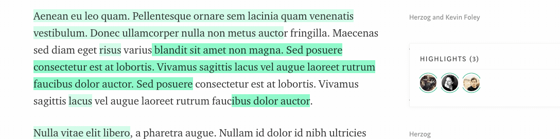
Further, when we consolidate highlights, we render a popover with avatars of those who highlighted and then show who highlighted what when hovering:
We’re still working through these nuances. They’re not critical to the feature (because highlights are usable now) but these additions help make the feature feel polished and thoughtful.
Additionally, we tackled highlights last. I think it was hard to end with this feature because it was by far the most time-intensive and demanding part of PPPP, in my opinion. The most important part though, is that they work (!!) and we’re making #continuous-improvements.
4. Establishing clear design standards is essential, especially when working in Agile.
Here at Medium, we use the Agile method for software development. Working within this method as a designer 1. is not a straight-forward task because it was not designed for designers and 2. means constantly asking myself these questions:
- Does this implementation meet our design standard?
- What exactly is our design standard and how do we preserve its integrity while working in 2 week sprints?
- At what point is a design requirement blocking?
I do have a framework for how to answer these, but every feature is unique and PPPP was exception.
Agile Alliance’s definition of Incremental Development:
Nearly all Agile teams favor an incremental development strategy; in an Agile context, this means that each successive version of the product is usable, and each builds upon the previous version by adding user-visible functionality.
Often, what’s ‘usable’ and what’s considered meeting a design quality standard don’t align. Sometimes it does. Maintaining ‘velocity’ and simultaneously preserving a standard of design quality is tricky business.
I know that moving forward and rapid iteration mean making compromises and that sometimes those compromises are ‘design polish’. That’s alright — just as long as we have a shared understanding of what our design standard is and an established plan to meet it. The best part about PPPP is that we now have a foundation to iterate faster and a space for design to thrive 🌈.
5. People feel more invested when you involve them early.
As our updated design system started to take on a firmer shape, I encouraged engineers to participate in its formation — as they are also users of the system.
Engineers would join our design system syncs and offer their input for typographic nomenclature, logic, or architecture in order to make the system more user friendly for both design and engineering. This may seem trivial, but their input and involvement led to more clarity and ultimately a stronger framework. People involved in these contributions said that they felt invested in the collective system we were working towards. I believe this sentiment and shared understanding positions us well for future development.
6. Documentation is everything.
One of my goals with PPPP was: Advance and integrate design system components. A small portion of that is actually getting eng to use them. The larger part is creating documentation and resources for all users of the components: both engineers and designers. Below are some attempts at creating documentation and resources:


I have hopes and dreams to build more resources and documentation into Storybook and Figma including active examples, over-arching patterns, support with usage, and design principles that guide our decisions kind of like this or this.
In conclusion
- Design plays an enormous role at Medium, even in migrations.
- Establishing a living design system that both engineering and design feel invested in is a huge win.
- Nothing is sacred, but establishing foundations helps to create more space for innovation.
If you’ve made it this far in my story, I want to reward you with a special treat for Harry Potter fans (or anyone curious about music inspired by web stack migrations) — a song that Herzog created to celebrate this milestone in Medium’s history.

