Death to typewriters
Medium typography details
❦
This is my sworn enemy:

Yes, it’s a beautiful object, molded in then-state-of-the-art plastic by respected Italian craftsmen. It’s cuddly. It’s portable. Even its name — Olivetti Valentine — is welcoming. Just looking at this thing makes you want to become a writer, and to take your writing anywhere.
It’s a beautiful object. But it’s also a doggone typewriter.
You see, I blame typewriters for double-handedly setting typography back by centuries. Type before typewriters was a beautiful world filled with hard-earned nuance and richness, a universe of tradition and craftsmanship where letters and their arrangement could tell as many stories as the words and passages they portrayed.
Just look at this example I typeset recently. There are twenty subtleties hidden there; twenty typographical details I find gorgeous. Do you want to try to find them all?
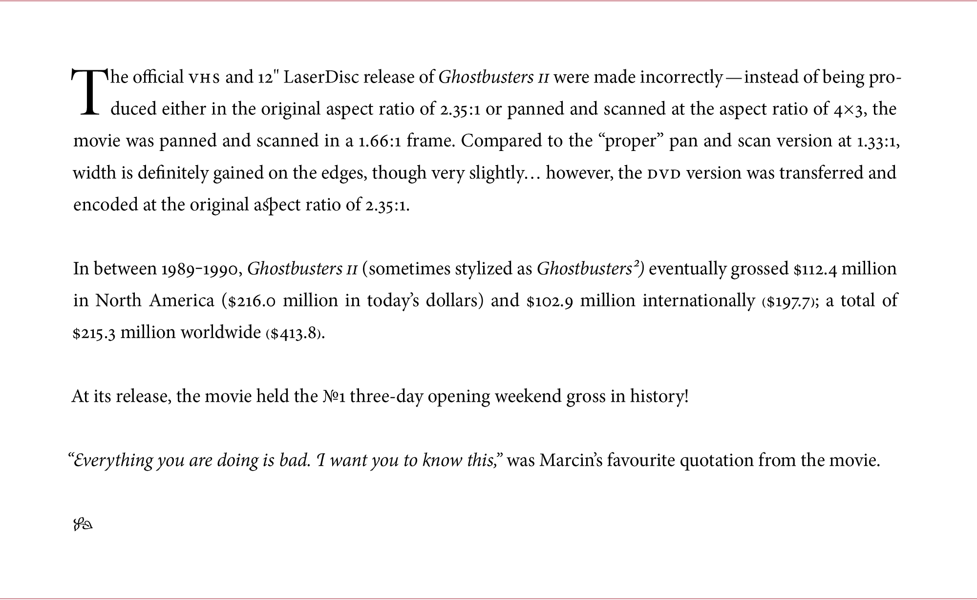
If you need a hint, here’s where they are:
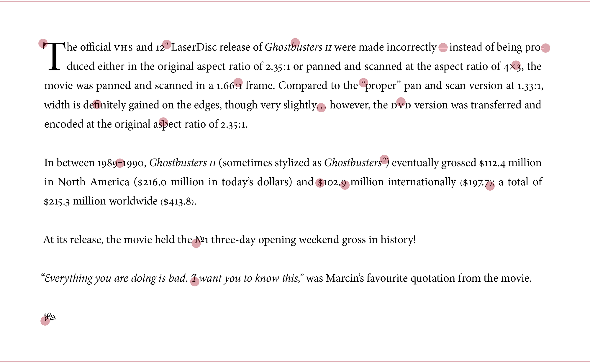
And here are all the descriptions:

All those details! It was an amazing world. But then, in the late 19th century, this guy came around:

This is Sholes and Glidden, the first popular and commercially successful typewriter. Launched in 1874, as modern offices started dotting the landscape, it brought to them the ease of fast, legible correspondence. It started an industry. It is even credited with bringing women into the workplace. (And yes, the pedal at the bottom is Enter. Every new technology owes a bit to technologies that preceded it — this time to sewing machines.)
It was a great invention. But if you look at its QWERTY keyboard, it is not just missing advanced, nuanced typography features. It’s missing basic stuff.
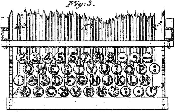
This is from the official patent for QWERTY keyboard. Note: There are no keys for 0 or 1. No parentheses. No exclamation point. Not even a Shift key (it won’t be invented for the next five years).
Suddenly, all of those hard-earned nuances were out the window. This is the same few paragraphs, coming from a typical typewriter in the early 20th century:

In case you want to get very sad, here’s a summary:

But, wait. We lost not only most of the nuances… things deteriorated even more. Check out how typewriters badly influenced typography:

This is Sadness Central. (If you’re interested in digging in more, Matthew Butterick has an excellent list of bad typewriter habits.)
Those habits wouldn’t matter that much, originally; books and newspapers during that time proceeded with more sophisticated machinery and largely excellent typography. But, typewriters transmuted into teletypewriters, then into teletypes, then into “glass teletypes” (teletypes with actual “glass” computer screens), and eventually into computers.


And thus typography of early personal computers was essentially typewriters, realized in pixels:

Those personal computers of the 1980s became today’s laptops and smartphones. And somewhere deep inside your modern computer’s operating system, there’s still a command line window that harkens back to it all.
Fortunately, in the last decades, through support for things like vector fonts, high-resolution displays, and Unicode, we reclaimed a lot of the good practices of setting type in print. But it is not uncommon to see websites without appropriate dashes, with ASCII apostrophes instead of proper quotes… not to mention bigger subtleties like hanging quotes, ligatures, or proper small caps characters.
❦
Here at Medium, we’re still fighting to bring it all back. Below is a list of the things we are doing to advance on-screen typography. We wanted to share it for two reasons:
- Grab our ideas and practices, implement them elsewhere, and improve on them. We put together a sibling document with technical details of what we do — we hope you take them for a spin, reuse, and make better!
- Hold us responsible to best possible typography on Medium, and point out the things that could be improved.
We broke down our list into six sections:
- Typography is for everyone
- Making type read well and look good
- Punctuation binds the words together
- Typography is more than just letters
- Whitespace is as important as content
- User interface sets the tone
There’s so much more to do. We’ll be working on supporting more languages and typographical customs; we want to explore adding small caps and drop caps; the Unicode smiley faces — ☺☹ — give me nightmares like you have no idea, so they’ll need to be redesigned also. (I mean, seriously, just look at them. Why on Earth is one of them bigger than the other?)
We’re also constrained in many ways by browser support for things we want to do.
Please tell us how we’re doing, teach us new things, and help us prioritize our efforts. Leave notes on this document, email typography@medium.com, or tweet at @MediumDesign… send us feedback no matter how small it might seem. I’m already looking forward to it.
Many people say we’re largely in a post-PC world already… I want to make sure it’s also a post-typewriter one. We can bring back the glorious typography of the days before typewriters, and then make it even better.
❦
Thank you to Dustin Senos, Nick Santos, Gianni Chen, Daryl Koopersmith, Kyle Hardgrave, and many other Medium employees who helped with and supported the above features. Also, thank you to Tim Ahrens, Bram Stein, Sean McBride, Craig Mod, Jean-Daniel Guyot, and others who helped me learn more about typography and provided valuable feedback.
In the Medium typography series, we previously covered underlines, hanging quotes, Whitespace, pilcrows, and Polish S. Are we missing something interesting? Want to know more? Email us at typography@medium.com.
Also, we’re looking for ambassadors in different countries — people knowing their language, caring about typography, wanting stories on Medium to look and behave most properly for where they are. Let us know at languages@medium.com. Thank you!